News
There's A New World Trade Center Logo

It may not be completed yet, but it's been given an official emblem. On Wednesday, the World Trade Center debuted its new logo on a display panel hanging from a construction fence. Design and brand consulting firm Landor Associates, which counts everyone from the U.S. Department of Homeland Security to Kraft Macaroni & Cheese as clients, created the black-and-white geometric logo. It may look simple at first glance, but the symbol is rich with meaning.
When broken down, the logo consists of five long, white rectangular bars positioned in a checkered pattern with three bars on the top half and two on the bottom. The background is black, which makes the white bars stand out in stark contrast. From afar, it looks like a severely pixelated W, or a blocky trident. The simplicity of the shapes and color scheme hints of something somber, but also suggests strength.
According to the New York Times, the three white bars on top reference the three-pronged columns that used to make up the facade of the Twin Towers. After surviving the Sept. 11 attacks, these tridentlike columns have become a symbol of endurance for New York City and were permanently installed in the 9/11 Memorial Museum in 2010.

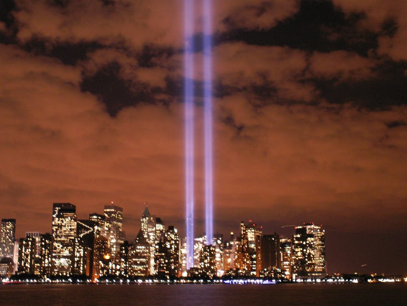
The NYT pointed out two other profound references: The two negative spaces on the top half are meant to pay homage to the two light beams from the Tribute in Light that shine every Sept. 11, and the two white bars on the lower half symbolize the pools at the National September 11 Memorial.
The five white bars also suggest that each one stands for a building in the complex, which will include the already completed 7 World Trade Center, the nearly completed 1 and 4 World Trade Center, 3 World Trade Center, and 2 World Trade Center.
According to the NYT, Landor's new logo will not replace any of the individual components of the World Trade Center site. Instead, it's meant to be a visual reference for the overall site and will be included on wayfinding signs and directories, as well as websites, apps, and marketing materials.
So what do New Yorkers think about the new logo? So far, the reactions have been mixed.
Image: WNYC/Twitter, Jason Thomas/Flickr, Jackie/Flickr
