News
15 Adventurous Hillary Campaign Logo Designs
Hillary Clinton's campaign has stirred up a lot of excitement and attention from basically everyone who wants to get in their two cents about a potential political phenomenon. And it's not only Americans who are getting inspired by the Clinton campaign, either negatively or positively. Amateur designers from around the world are contributing to an online contest to improve Hillary Clinton's campaign logo. The contest has been open for only 14 hours, and contestants have five days left to enter, but there have already been more than 200 entries submitted to the LogoMyWay page.
In an email to Bustle, Joe Daley of LogoMyWay said the conversation he saw online about the logo prompted him to open the contest.
We have a very active design community and the designers started a thread in the forum on how awful Hillary's logo is. I thought it would be a great opportunity to showcase the talent of the LogoMyWay community and get some designers from all over the world involved. I started a logo contest to redesign the current logo and the designers are having a blast.
The contest is still open for submissions, and Daley says the general public can view and vote on submitted designs. The contest parameters say entries should communicate "America," "presidential," and "simple." Sounds easy enough.
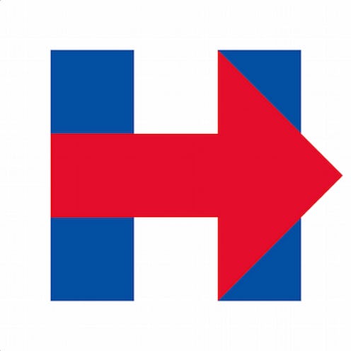
So, why does everyone want to change Clinton's logo? It's true that the logo is pretty basic — it's essentially just an H figure with an arrow through it, pointing right to symbolize progress. But the simplicity of the image has prompted critics to call it boring and even plagiaristic, as some people say it looks too much like a hospital sign or the FedEx or WikiLeaks logos. Some call the logo "weird." but no matter what you think, at least you're thinking about Clinton.
Here are 15 potential new logos that showcase Hillary's campaign in the best — and worst — ways.
1. Fadeout Flag

This logo takes a new spin on the existing design, essentially just extending the arrow and adding some flair with swirly American flag-type patterns. My personal favorite aspect of this logo: the care the user took to include patterns within the words "Hillary Clinton," inserting them in the reverse order of the H itself.
2. Rand Paul? A Kite?

Once again, the same user twists around the original design, but the arrow looks more like a waving flag than a clear directive. Also, there's a little twirl of a flame at the root of the logo, which looks a whole lot like Rand Paul's underwhelming torch logo.
3. Friends

This is pretty, but there are a couple of issues here. First of all, the Clinton signature has only one L in Hillary, but her name actually has two Ls. Also, doesn't the font in the logo look less like it's advertising an official presidential campaign and more like it's introducing an episode of Friends?
4. Blank Space

There's some interesting negative space going on here. The design also takes advantage of the potential reverse symmetry in the two halves of the H, but the star floating through the middle looks a little too much like a sperm for my taste — but hey, everyone's different.
5. Walk This Way

This is actually one of my favorites, because it's an idea we haven't seen before. I also did not see any others with the same visual concept in all the contest entries. Nice work, Pixma.
6. Star Power
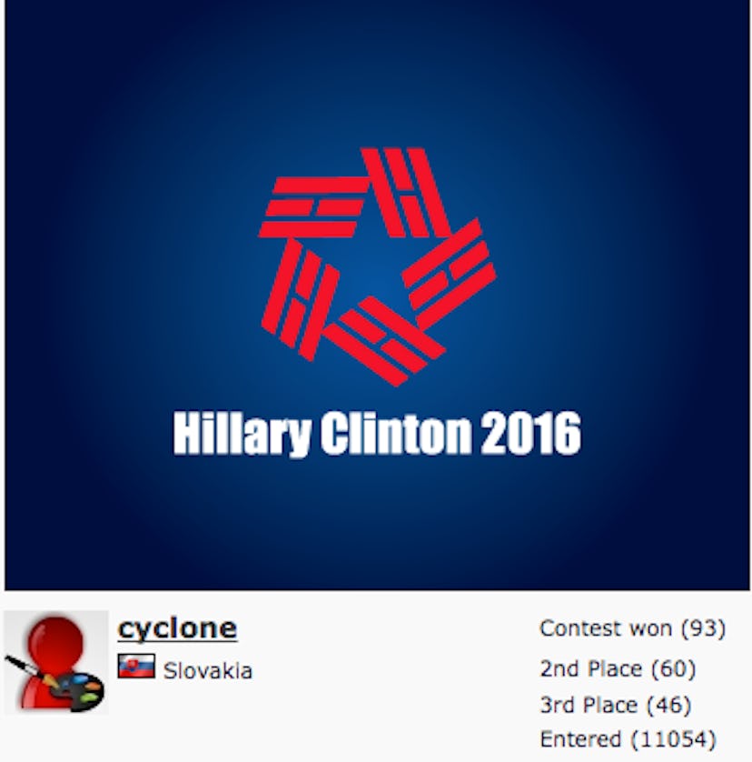
This is the most confusing, disorienting logo I can imagine. It's more like an optical illusion than a functioning campaign strategy. Are you getting dizzy yet?
7. Initial Impression

This logo incorporates both of Clinton's initials, eschewing the strategy of using Hillary's first name to set her apart as a female candidate. It also subliminally reminds Americans to watch CNN.
8. Illusion

I take back what I said about that other logo being the most confusing one possible.
9. Abstract

There are a lot of moving parts in this design. Like Number 7, it incorporates and even emphasizes the "Clinton" part of Hillary Clinton by highlighting the C figure, but the average American citizen might try to draw a maze through it instead of thinking about economic policy.
10. ...

I'm willing to give this person the benefit of the doubt and say it's possible he or she doesn't realize that this logo is basically a swastika.
11. Redux
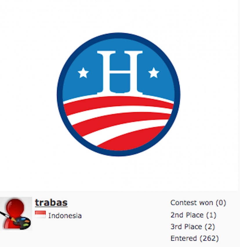
This is a fantastic design! Unfortunately, it is a dead ringer for Obama's 2008 campaign logo. Better luck next time, Trabas.
12. Less Is More

This is my personal favorite. It's simple, classic, and identifiable.
13. Flame Thrower

This looks like a cross between the Paul logo I mentioned earlier and, more significantly, the NFL icon.
14. Mix-A-Lot
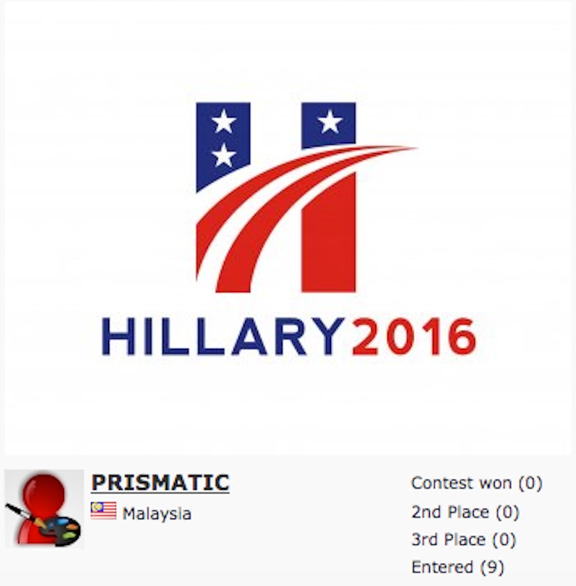
This design has a lot going on. It combines the original arrow design with the potential implication of a road ahead — my pet favorite — and the words at the bottom that so many designers have added to their work to further define it as a 2016 campaign logo, although I doubt anyone would have a hard time figuring that out without the caption.
15. Home Sweet Hillary

I don't understand why this logo has to invoke an image of domesticity. Why add the unquestionably domestic roof of a classic suburban family house? The star on top even makes it look something like a Christmas tree. Besides the confusing stripes and the serif font, the implication that voting for Clinton will bring some kind of homeyness to the White House is what turns me off to this design.
Images: Hillary Clinton (1); Giphy (1); LogoMyWay (15)
