News
A Ranking Of Presidential Candidates' Logos

As of Monday, there are 15 people running for president of the United States. Each candidate has their own political ideologies, plans for how to improve the country, and, of course, their own unique logo. A presidential campaign would be nothing without a recognizable logo. How else would voters know which candidates' website they stumbled upon or whose political rally they're attending? Along with wondering who has the best education policy, stance on gay marriage, and dedication to gender equality, voters also have to ask themselves, which presidential candidate has the best logo?
The logo says a lot about the candidate — how bold they are, how creative they are, how unique they are. Just about anyone can slap their last name and "2016" on a white background, but an original advertisement shows innovation. Let's be honest, candidates who don't take the time to create a thoughtful logo are probably cutting corners elsewhere too. We need a president that focuses on the details and the small issues facing the U.S., as well as the larger international problems.
Here's a definitive ranking of all the presidential candidates' logos, from those that make you want to jump for joy to the ones that bore you to tears.
1. Hillary Clinton
Hillary Clinton's campaign logo is by far the most creative. It doesn't even say her name, but it's already easily recognizable as Clinton's brand.
2. Ben Carson
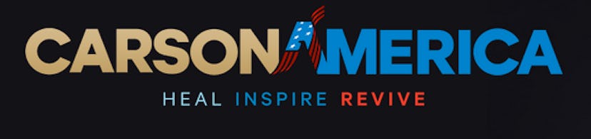
Surprisingly, Ben Carson's campaign team created a pretty cool advertisement. It's simple, yet has enough flare that it isn't boring. If you look closely, the inside of the first "A" is the outline of an eagle and the red stripes on the letter wave up like a sash.
3. Carly Fiorina
Carly Fiorina's brand is clean, simple, and looks slightly patriotic without being cheesy. It could easily pass for a high-tech business's ad, which isn't shocking considering her business background.
4. Marco Rubio
Marco Rubio's is young and fresh. Using all lowercase letters and a rounded font gives it a youthful vibe, and the outline of the U.S. dotting the "i" is a little strange, but it works.
5. Bernie Sanders
Bernie Sanders's brand is traditional in a good way, though it could use a little more flair.
6. Mike Huckabee

Mike Huckabee's logo is patriotic and classic, while still adding a little uniqueness. However, it isn't cool enough to really draw anyone's attention.
7. George Pataki

The simplicity of George Pataki's logo makes it kind of cool. Nothing about it is super exciting, but it's also easy to read and the simplified flag adds an updated touch.
8. Lindsey Graham

Lindsey Graham's logo is just alright. The placement of the "16" makes it a little confusing — at first glance it reads like there are 16 Grahams (and no one wants that).
9. Rick Santorum
There's only one way to describe Rick Santorum's: boring.
10. Lincoln Chafee
Lincoln Chafee's logo doesn't look like a presidential ad as much as it does a bad car company logo.
11. Rick Perry
Rick Perry's resembles the Popeyes logo a little too closely. I think we know where his campaign team got their ill-fated inspiration.
12. Rand Paul
Rand Paul's logo weirdly resembles the Tinder banner, and that's a major turn off. I swiped left.
13. Ted Cruz
Much like Paul's, Ted Cruz's brand is all about the flame-shaped American flag, which doesn't make any sense.
14. Jeb Bush
In the hope people would forget his familial ties, Jeb Bush's new logo completely leaves out his last name and is plain boring.
15. Martin O'Malley
While Bush's is pretty bad, Martin O'Malley's logo takes last place. Out of context, it's just really confusing — "O'M" could stand for a million things.
Images: Hillary for America (1); Carson America (1); Huckabee for President (1); Pataki for President (1); Lindsey Graham 2016 (1)
