
The 2020 presidential campaign is well underway, meaning lots of candidates are already using things like logos and posters to promote themselves. These materials help visually represent the candidate and the tone of their platform, and if the design is done just right, they can make a huge impression on the American public. In fact, some unforgettable presidential campaign logos from over the years show politics and design are more intertwined than you'd think.
"[Campaign design] should be reflective of the cultural moment, distinct from competitors, and emotionally compelling to its core audience," Anjelica Triola, the co-founder of The Creative Caucus, a company that connects designers with progressive political candidates, tells Bustle via email. "A memorable visual identity system ... [should] communicate something special about the candidate it represents."
Triola emphasizes that design can give voters a sense of how a candidate will approach the office for which they are running. Iconic campaign logos and designs often reflect a break with tradition, she adds, citing recent millennial congressional campaigns from Alexandria Ocasio-Cortez and Suraj Patel, who opted for campaign colors outside of the "red, white, and blue [campaign design] establishment."
As Triola outlines, it's clear that design is intrinsically linked to a campaign's identity. To illustrate that connection, here are some memorable campaign logo designs over the years that made lasting impressions, for better or for worse.
Dwight D. Eisenhower, 1952

Christopher Klein of History.com reported that Eisenhower's 1952 presidential campaign was particularly memorable because of its catchphrase, "I like Ike," which was emblazoned across many of its campaign materials. "Ike’s simple, cheerful slogan resonated with the times, and the pithy rhyme had the added advantage of fitting easily on campaign buttons and bumper stickers," Klein reported in an August 2018 article.
"Ike" refers to Eisenhower's nickname, Reference.com noted, and the phrase was popularized during a television campaign ad. In fact, Eisenhower was the first-ever U.S. presidential candidate to air a television campaign ad, according to 6AM Marketing, and it incorporated that slogan into a jingle.
Robert F. Kennedy, 1968

Robert F. Kennedy, former President John F. Kennedy's brother, ran for president in 1968 to challenge two other Democrats seeking to replace President Lyndon Johnson at the end of his term. Kennedy was never able to finish out his campaign, as he was assassinated on June 5, 1968.
Triola tells Bustle via email that she views Kennedy's campaign materials as iconic because of both their message and style. As she puts it:
I refer back to Robert Kennedy's 1968 Presidential campaign for creative inspiration often, not just because of its minimalist aesthetic and composition but also because of its powerful message. With the Vietnam War and civil rights movement in full swing, 1968 was another period where activism was a lifestyle. RFK's pared down logo and posters delivered a fresh brand promise that would still resonate today with anyone who's weary of the status quo — new ideas, culturally-literate, nothing to hide.
Triola also emphasizes that the practicality of Kennedy's campaign materials made them especially effective. "RFK's posters also did a great job of sharing not just his name, but his ethos and the election date," she notes. "These two often-overlooked pieces of information are critical in making a real impact on voter turnout."
Shirley Chisholm, 1972

Chisholm was the first woman and the first African American to seek a presidential nomination from a major party in 1972. She was also the first-ever African American congresswoman. Notably, Eye on Design reported that Chisholm's campaign buttons featured the colors yellow and red, standing out from other contenders' blue, red, and white campaign materials.
CBS News noted that Sen. Kamala Harris' 2020 campaign logo seems to pay homage to Chisholm. The senator's campaign logo also heavily features red and yellow as its predominant colors.
In addition to having unique campaign colors, Chisholm was also known for her slogan, "Unbought and unbossed," as The Undefeated, a website that reports on the intersections among race, sports, and culture, noted. This slogan was featured on many of her campaign materials and represented Chisholm's confidence and courage in her bid for president.
"That slogan was who she was, she lived it," Shola Lynch, a filmmaker who created the documentary, CHISHOLM ’72: Unbought & Unbossed, told The Undefeated. "Her involvement in politics was her asserting herself. She didn’t ask for permission, she just did it."
Jimmy Carter, 1976 And 1980

According to Campaign Buttons, Etc, a website that sells historic presidential campaign buttons, Carter's iconic green and white campaign materials were used to draw attention to his background as a rural peanut farmer. At the time, these colors stood in stark contrast to the red and blue campaign materials used by his political opponents. Carter used the color in both his 1976 and 1980 presidential election campaigns, the latter of which was unsuccessful.
Barack Obama, 2008 And 2012
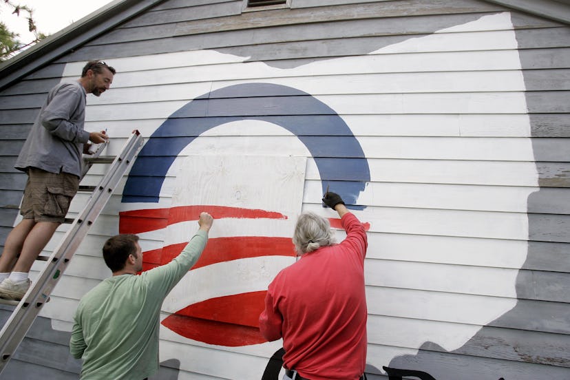
Barack Obama, the 44th president, had a unique campaign logo that featured a rising sun inside of an "O." Sol Sender, one of the six designers at Sender LLC who created the logo, described its meaning to Chicago Business in 2007. "We were looking at the "o" of his name and had the idea of a rising sun and a new day ... The sun rising over the horizon evoked a new sense of hope," Sender said.
When it was designed in 2007, the logo received a great deal of praise for being innovative and forward-thinking. “It begins to break with tradition while also rooting itself in tradition,” Peter Krivkovich, the CEO of the Cramer-Krasselt advertising agency in Chicago, told Chicago Business in 2007. “Patriotism is the foundation, but above that is hope, opportunity, newness.”
Margaret O'Mara, the Howard and Frances Keller professor of history at the University of Washington, concurred with the assessment that Obama's logo was groundbreaking. As she writes in an email to Bustle, the "sunrise logo is instantly identifiable and establishes his [Obama's] brand shorthand of cool, forward-thinking."
Jeb Bush, 2016
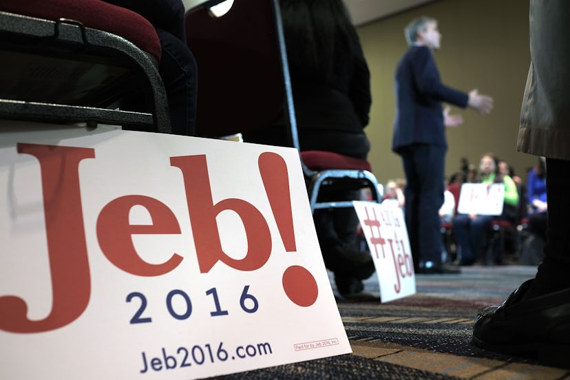
Bush ran for the Republican presidential nomination in 2016. As Forbes explained, his logo was a variation of one he had used in several political campaigns since 1994. The logo featured his name with an exclamation point after it and the year 2016 printed under his name.
Bush's logo received quite a bit of criticism after it was released, both from the public and from design experts. For example, Elizabeth Cady Smith, a design director for Zady, told Fortune that while it was wise for Bush to leave his last name off of his campaign materials, some aspects of the logo were off-putting.
“From a design point of view, I don’t mind the Jeb! sentiment,” she told Fortune. “But the J seems stupidly elongated and the exclamation point feels cartoonish. The really lightweight 2016 is slapped on and has nothing to do with the typography of the Jeb!."
Laura Kunkel, creative director at Blue State Digital, says in an email to Bustle that Bush's logo attracted attention for the wrong reasons, something that doesn't necessarily bode well for a presidential campaign. As Kunkel describes to Bustle:
Good campaign logos get out of the way of the message. Bad campaign logos have you talking about the logo design instead of the ideas and the promise. They’re a distraction. The best logos amplify the attributes that play to the candidate’s strengths and mitigate their weaknesses. The forgettable ones lack a point of view all together — and the worst logos try to have a point of view, but fail to resonate the public. I will never forget Jeb! And his enthusiasm! For this reason!
Hillary Clinton, 2016

Hillary Clinton's 2016 presidential campaign logo is iconic both because of what it represented and because of the controversy it generated. First, Clinton's logo is notable because it represented a historic nomination, as she was the first-ever woman to receive a presidential nomination from a major party.
However, her logo, which was designed by Michael Bierut, is also memorable because of the very mixed public reaction to it. As Wired described, some people criticized the logo, which features two blue rectangles connected with a red arrow, as unattractive and overly simplistic. New York Magazine's Intelligencer also noted that people complained the logo looked too much like other logos for corporate brands, and that it gave off conservative vibes because its arrow pointed to the right.
While it received a good deal of criticism, some design experts commended the logo for being very adaptable. These experts noted that the logo's simplicity meant that it could be easily incorporated into a host of campaign materials, Wired reported. Anne Quito, a design reporter for Quartz, shared similar thoughts in an April 2015 article:
As unoriginal and clunky as it may appear, Clinton’s logo is perfectly functional. It’s unique enough, with utility that holds up across print, broadcast, and digital platforms ... On Twitter, the red arrow is even a nifty, albeit unnecessary, device that directs the eye right to the messenger.
As history illustrates, logos and campaign materials can certainly influence the tone and trajectory of a campaign. But design and history experts alike stress that it's important to remember that this influence only goes so far, and that, at the end of the day, it's the candidate who determines a campaign's success.
Logos "are significant only to a point. They are reflective of a broader media environment ... and they are designed to grab attention in an information-saturated environment," University of Washington Professor O'Mara writes to Bustle. "But a great logo doesn’t win elections — a great candidate does."
Kunkel, of Blue State Digital, agreed.
"We’re a country that loves stories, and so we remember the message and how or if we connected to it," she writes to Bustle. "For that reason, most people will say they remember Kennedy’s or Obama’s [logos], but that’s mostly because the man and the message — not the mark — were memorable."
