Style
This Eyeshadow Palette's Scattered Layout Has Twitter Throwing Hilarious Shade
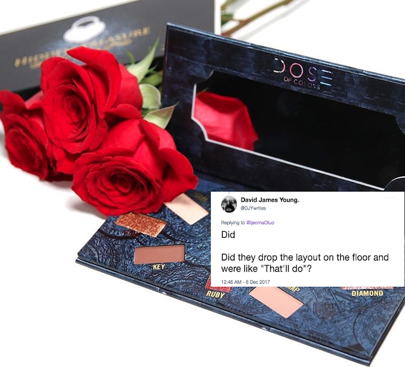
The beauty-loving Twitterverse is just not having it – especially with one eyeshadow palette that features an avant-garde layout. If there's a perceived wrong committed in the beauty community, Twitter users have no problem putting their thumbs into action to draft the shadiest tweets. And that's exactly what happened when an astute beauty lover sparked a thread dedicated to the Dose of Colors Hidden Treasures Palette and its unique layout.
The limited edition palette is nothing like shadow sets from other brands. You won't find this range of earth tones and metallic neutrals organized in a traditional, easy-to-use setup. Instead, the product scatters shadow pans in different orientations throughout the palette.
The palette design doesn't match any other shadow sets in the brand's lineup, which feature a more traditional layout. Neither the Marvelous Mauves eyeshadow palette nor the summer hit Eyescream palette feature this kind of design. And Twitter is certainly wondering why Dose of Colors changed this palette up.
Calling the brand out for the strange layout, writer and editor Ijeoma Oluo put the palette in the spotlight on Dec. 6 through a series of tweets. According to her posts, there's just no explaining this kind of layout for beauty lovers who want a user-friendly palette. And Oluo wasn't the only one to give their two cents about Hidden Treasures, sparking countless other users to weigh in on the design.
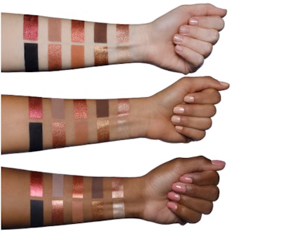
Layout and shade names aside, the palette does feature a beautiful color range. The mattes swatch with a super pigmented punch and the foiled hues look unreal against the skin. It's worth noting that the shades look heavenly against a range of skin tones. Swatches like these speak to how the internet-based, indie brand became a mega hit in the first place.
But Twitter still went in on the palette design — and certainly did not hold back.
Dose of Colors has yet to address the subject. Bustle reached out to the brand for comment.
And when words simply wouldn't do, there were hilarious memes to visually explain frustrations with the palette.
But it wasn't just the scattered nature of the pans that got the Twitterverse riled. Users critiqued the product for not using space wisely.
The Hidden Treasures shade names weren't safe from internet commentary either. Twitter made a point to call out the titles, too.
For some, the color names made about as much sense as the layout.
And then there was talk about the color family. With such serious palette analyses going on, someone was bound to notice a few similarities in the shadows.
Users always pointed out that the shade names had a "chaotic" layout, which may have been intentional in the name of sticking to a scattered design.
Some users even cheekily hypothesized on how the palette layout came to be. Because what's Twitter without humor?
Dose of Colors' arrival to Ulta Beauty makes Hidden Treasures even more accessible to the masses, and there's no denying how gorgeous its formula looks from the brand swatches. But the internet seems to have some serious thoughts about its packaging.
Don't you remember the adage of not judging a book by its cover?
