The most boss feeling you ever get as a little kid was opening up the mailbox to your very first magazine subscription, addressed with your name on it and everything. For us, that was basically the dawn of magazines, so we don't often think about the evolution of magazine covers that scale back to way before we were born. Well, we're all about to get our minds blown by Karen X. Cheng and Jerry Gabra, who painstakingly collected before and after versions of all of the top magazines over the last 100 years. Some of them span back to the 1800s, before you were even a tickle in your great-great-great grandparents' brains. And boy howdy, have the times changed since then.
"I saw an old cover of Seventeen magazine from the '90s, and thought it was so fascinating to see how things have change since then," Cheng wrote to Bustle about her inspiration for the project. "So I figured it would be interesting to go back all the way to their first issue — and then decided to do it for the other magazines too." To find the old magazine covers, they waded through eBay, Pinterest, and Google, finally culminating into a beautiful visual representation of just how much both society and print literature have changed over the past century. Here are the fascinating results:
TIME

TIME is actually one of the magazines that didn't appear to navigate too far from its roots: it still features icons of the present, still has its red border and bold font, still covers the same range of topics. I guess you could say that TIME is ... timeless. (Please praise me, I'm hilarious.) Here are covers from every decade back-to-back, for perspective:

While occasionally we see deviations, the general trend is the same. They stick to what works.
Vogue

While Vogue has transitioned from hand-drawn art to the compelling portraits they feature today over the past 100 years, they still kept the same classy, sophisticated style.

Seventeen

Oh, Seventeen. Nothing got my teenybopper heart racing quite like seeing one of these brightly smack-you-in-the-face colored mags in my mailbox every month. But while the text stayed the same, the magazine has made a very firm departure from its muted colors and transitioned into the WHOP! BAM! POW! that grabs readers' attention today. Of course, the shift in message we're sending teens is a little disheartening — you can see the transition here:

I'm not even sure where to focus my eyes on the later ones. I must have lost that ability with my now faded youth ;(.
National Geographic

Progress has been exceptional for all of you visual science nerds out there. I have no memory of a world where National Geographic was so text-heavy, but apparently it wasn't until the '70s that they started making covers with iconic, visually engaging photographs that we all know and love.

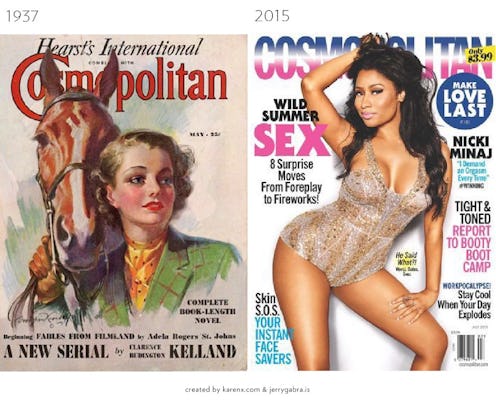
Cosmopolitan

I think this one is by far the largest transition in women's magazines — from hand-drawn, buttoned up, and minimal text to grabby font, bright colors, and very blatant celebration of sex women's bodies. That Nicki Minaj shot would have been a real shocker in 1937, that's for sure.

The New Yorker

The only constant in The New Yorker is that there really aren't any, aside from the title font. They have maintained the hand drawn covers since their launch, including this homage to an early cover made in celebration of the 90th anniversary. Here are images of the magazine through the ages, proving just how timeless the format of them is:

GQ

I think if you take a look at the evolution of GQ, you'll notice one glaring difference right away ...

OHHH, right. Guys like seeing half-naked chicks on their magazines. And hey, obviously the formula is working for them — although it's a little surprising to my '90s born brain that this didn't happen way earlier than that. (Also, is anybody else having too many feelings thanks to that Robin Williams picture right now??)
Vanity Fair

Vanity Fair is another publication that gracefully transitioned from hand-drawn imagery to rich, full color photos.

In an article for Medium, Cheng noted during her collection of these covers one very difference that truly emphasized the importance of the Caitlyn Jenner cover:
The other covers are littered with mounds of text. Not this issue.
Call me Caitlyn. Just three words.
They didn’t need to sell the other stories. This issue was all about her. Vanity Fair nailed it.
You go, Caitlyn!

So there you have it — your favorite magazines over the last 100 years. Make sure you bookmark this, so in the next 100 years when all of our magazines are three dimensional choose-your-own-adventure fairylands, you can look back on 2015 you and have a hearty laugh about it.
Images: Courtesy of Karen X. Cheng and Jerry Gabra
