News
Meet The In-House Team Behind Google's New Logo
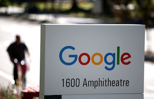
If Google is recognizable for one thing and one thing only, it's the sheer enormity of everything. From its vast Internet scouring to its uncanny ability to collect personal information from just about anyone that's ever even thought about buying a computer, there's no denying that Google is big. Google's staff of top-rung employees, too, is huge: In 2014, the company reported that is had a total of 53,600 workers under its supervision, ranging from tech geeks to marketing geniuses and beyond. After a massive restructuring under a new parent company called Alphabet last month, Google debuted a new logo designed in-house by a team of employees from across the corporate family — and despite what the social media sphere argued, it was pretty fantastic.
"Since its inception, the Google.com homepage has been strikingly simple," wrote the design team on its blog this week. "But as technology moves forward [...] users ... engage with Google using a constellation of devices, and our brand should express the same simplicity and delight they expect from our homepage, while fully embracing the opportunities offered by each new device and surface."
The concept was easy enough: Pool scraps of the old Google, with its recognizable "blue-red-yellow-blue-green-red color sequence," as Wired called it on Wednesday, add in a dash of childhood innocence to reflect the Alphabet restructuring, and voila — instant perfection. ... Sort of.
Google User Experience Designer Alex Cook, Creative Lab's Jonathan Jarvis, and lead Material Design Team designer Jonathan Lee explained in their blog that it wasn't exactly that simple. After meeting up in New York earlier in the year for a week-long collaboration session, the team identified four potential issues that designers would need to overcome before settling on a final logo.
The first was the need for a scalable design that would still look good in shrunken spaces (at the bottom of a search page, for example); Second, the team would need to incorporate "dynamic, intelligent motion" that would appeal to users at each phase of any given interaction. For its third and fourth potential problem areas, the design team would need to find a set of images that would allow for consistency across all platforms, as well as staying true to its "Googley" self (yup, that's the word they used).
The team explained,
We started by distilling the essence of our brand down to its core—four colors on a clean white background—and built it back up. Stickies were stuck, pins were pushed, and beziers were animated. With the cutting room floor littered with hundreds of hours of design work, we set out with a few directions that excited us.
After meeting with engineering, research, product, and marketing teammates from different corners of the Google family tree, the group finally settled on one particularly clean, almost playful design that noticeably did away with one classic Google logo aspect in particular.
"Google's Logo Killed Serifs Because Serifs Had It Coming," Gizmodo boldly declared on Tuesday. The tech blog wasn't wrong: The little feet and decorative arms attached to most lettering on any given website do make copy easier to read, but it has little use in titles, headers, and logos (unless you count "aging 20 years" as a respectable design tactic).

Not only did the serif-trashing give the logo a cleaner look, it also brought it into the current century by drenching it in contemporary minimalism.
"The Google logo has always had a simple, friendly, and approachable style," wrote Cook, Jarvis, and Lee on the team's blog. "We wanted to retain these qualities by combining the mathematical purity of geometric forms with the childlike simplicity of schoolbook letter printing."
Of course, the new design isn't without its trademark quirkiness: In keeping with its tradition of playful forward thinking, the team tipped up the final letter E, just for good measure.
"[It's] a reminder that we’ll always be a bit unconventional," they wrote.
Images: Google Design Team
