Life
When Hipsters Draw CPR Posters...
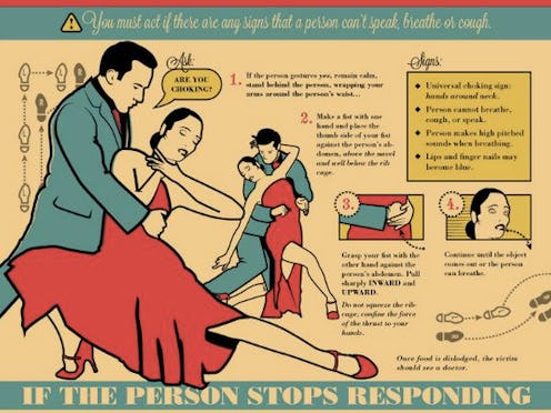
The latest trend in New York City restaurants has nothing to do with food. Instead, look out for hipster eateries’ new obsession: artistic choking posters. Interior designers are now sacrificing clarity, and consequently, safety, for stylish depictions of CPR.
Why bother with legible font, stick figures and primary colors when you can portray the same activity in a cartoonish pencil sketch, glamorous tango analogy, or retro beach-themed illustration?
Lara Antal, one of the designers, told Business Insider that she believes aesthetically appealing posters are likely to attract more attention so that people can learn from them outside of an emergency.
“They say art is editing. I focused on providing the most amount of information in the least amount of space...Good design can be present in any object, even when not in use.”
Alex Holden, another designer, also claims to prioritize the function of the poster. Having sold more than 300 copies of his work, he says that “there’s plenty of room to look nicer than the city poster and still be legible.”
We disagree. When it comes to safety instructions, good design should only refer to the clarify of the information being conveyed. Safety posters might be an eye sore, but a décor faux pas is worth avoiding the confusion a customer will experience when trying to decipher the steps of the Heimlich maneuver from a comic strip.
Here are some of the artistic examples:
