You all know how much I love a good chart, so here — we have a series of charts that anyone who is obsessed with the Serial podcast will definitely understand. Created by graphic designer and writer Michelle Rial for The Bold Italic, the charts are, like Serial itself, a variation on the This American Life theme. Back in September, Rial began a Twitter account, @ThisAmerChart, geared at graphically representing some of the random bits of knowledge we learn from This American Life; after Serial debuted at the beginning of October… well, it was only a matter of time before it got added to the mix, as well.
Although I think we do need to be careful about how we talk about Serial — after all, both the case and the people involved in it are real — I think Rial’s charts add an interesting element to the conversation. Yes, they’re pretty funny; additionally, though, they speak to how we’re consuming the podcast, which is definitely something worth discussing. Also, I’m willing to bet that most of us who have been following Serial do, in fact, have a Google search history that looks a lot like the one seen here.
Rial created seven charts especially for The Bold Italic, who were then nice enough to share a few of them with Bustle. Check out my three favorites below, and head on over to The Bold Italic to see the rest:
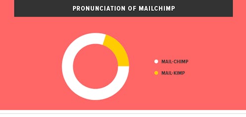
The Pronunciation of “Mailchimp”

Not going to lie: That one little voice going “Mail… kimp?” in the ad at the beginning of each episode makes me giggle every. Single. Time.
The Evolution of Your Google Search History:

You know it’s true.
Serial’s Rise to Prominence:

I think we’re about due for the backlash to the backlash now. Is anyone else kind of curious about what happens after that stage?
Images: Courtesy of Michelle Rial for The Bold Italic
