Books
The Painstaking Process Of Creating A Book Cover
My second novel, The Done Thing , came out earlier this year. I walked over to my favorite bookstore and there it was: face out on the "New Arrivals" shelf, the title I'd changed sixteen times, my name, and the images my publisher painstakingly positioned to draw the eye. The novel took years to write, the cover took weeks to design, and readers will spend maybe thirty seconds glancing at it before deciding to pick it up or not. As a novelist, this is terrifying. As an armchair psychologist, it's fascinating, especially after seeing the effort and strategy that goes into reverse engineering the "judging a book by its cover" experience.
The team at Tyrus Books — Publisher Ben LeRoy and Senior Graphic Designer Sylvia McArdle — knew they wanted The Done Thing's cover to in some way echo my debut, You Could Be Home By Now . It was an ideal jumping off point, in part because it would build (hopefully) on the momentum of my first novel and in part because that particular cover gets so much right. Its central image — a beat up toy truck — hints at the book’s whimsy and sorrow while giving nothing away. Its simplicity draws the eye, even on the tiny phone screens that so many people use to browse and buy.

And so we began our hunt for a single, symbolic object that would do the visual work of that toy pickup while telegraphing that The Done Thing would be darker than its predecessor. We brainstormed. I mentioned that my favorite small, telling moment in The Done Thing (which unpacks the decades-old aftermath of a triple homicide) involved a water gun, picturing a one for one substitution of my debut's toy truck for one of the pastel plastic water guns of my childhood. In theory, the toy would speak to the violence at the book's start, and to the preoccupation with children and child-rearing threaded throughout. Because I had an incredibly specific water gun in mind, I assumed it would also situate part of the book's action in the late '80s, and speak more to nostalgia and sorrow than to active violence.


These are great covers. They're arresting and ominous. They absolutely work for a book wherein a man discovers his wife's affair, shoots both her and her lover dead, goes on the lam with his young daughter, and is captured and brought to justice, but not before killing a police officer in the final confrontation. All of that happens in The Done Thing. However, all of that happens in the first two chapters. The rest of the book explores the fallout through the eyes of Lida Stearl, sister of the murdered wife, who puts much of her life on hold to raise her late sister’s daughter. Lida is absolutely the heartbeat of the book, and there is none of her slow, furious burn in the immediacy of these covers.
I suspect I would have become very annoying at this point in the design process, repeatedly mentioning the less pulpy, purple toy gun of my childhood, had the whole concept concept not hit another snag: Amazon’s all-important algorithm is weighted against covers with guns. Like most writers, I have complicated feelings about Amazon and a streak of white hair from checking and re-checking their rankings, still, that they have this stance in the interest of not glamorizing guns or normalizing violence had me feeling unexpectedly good about the company.
We decided to start over, linking the cover more deliberately to Lida: who she is, and what she does.

What Lida does is get by: she builds a career, maintains a happy marriage, and raises her niece in the wake of the murders. And then, decades later, she discovers that the man whose actions derailed her life is seeking pen-pals as he awaits his final appeal on Arizona’s death row. Raw and still in mourning, she begins to write him, pretending to be a very credulous, slightly flirtatious, 23 year old.
This cover, with it's packet of letters, speaks to this correspondence. It's also very pink, as books by or about women often are. And while Sylvia McArdle carried over the darker font from our initial concept and played visually with encroaching shadows, the pinkness of the background and faded writing on the letters themselves promises another sort of book entirely. One where a scrappy heroine is laid off from her hotshot job, perhaps, and returns to the small town she swore she'd put behind her, discovers a family mystery, and finds love with her former sweetheart. In short, a novel whose author treats her characters far more kindly than I tend to.
We played around with the letter concept a bit, trying a single letter, making its edges jaggedly torn, but it wasn't working. We moved on.

Ben LeRoy came up with this one, based on a partial shot of a motel pool, himself; one of the joys of working with Tyrus Books is how involved and engaged everyone is throughout the life of a book. The pool concept was enormously appealing, in part because it was unexpected. There are a handful of emotional scenes that take place in or around a motel pool in The Done Thing's final chapters, yes, but it is by no means a central symbol. Instead, it works as an evocative one. Motels (and their pools) are transitory places and often tinged with sadness, which hints at the turmoil I inflict on my poor characters.
Theoretically, I loved the pool idea; like You Could Be Home By Now's truck, it went for mood over explicit message. But in the end, it didn't quite work. None of our pool images were right. Some carried a too fun vibe of drinks with umbrellas in them. Some looked frankly unhygienic. We were never able to capture the sad-but-still-striving feel we wanted. We worried, too, that the artful, watery close up would find would-be readers thinking what, exactly, am I looking at? instead of the far more promising is this a book I want to buy?.
In the end the pool cover's greatest contribution to the end product was the degree to which it freed us from working too closely from You Could Be Home By Now's model.

This offering, with its pair of sharp black gloves, marked a conceptual return to the "single object" theory of book covers while also being the farthest afield from our You Could Be Home By Now starting point. It was also the only concept I actively disliked, despite the fact that mustard and black is one of my go-to color combinations, and its undeniable visual interest. Black gloves, like the water gun (and other items, including plaster teeth molds, peanut butter sandwiches, and an ugly broken plate with a rooster on it), are objects of emotional significance in The Done Thing but — and here's another point in the process where I expect I became very annoying — not these particular black gloves. They are entirely too elegant for the book and its narrator, the sort of gloves that might grace the hands (and cover) of a younger, kickier protagonist, one who works in an auction house or for an aging A-Lister and who, over the course of two hundred pages, finds herself and comes up in the world.
Before seeing this cover, I hadn't realized how specifically I had pictured Lida's gloves, or the water gun, for that matter; I have never been a strong visual thinker. This image also drove home, in a way I'd never quite articulated (despite a lifetime of reading and the publication of an earlier book) that the best covers evoke rather than translate, something that a closer examination shows was already at play here. Despite the too-sleek ways the concept missed the mark, Sylvia McArdle absolutely nails an ominous mood, positioning the scrunched gloves to create a sense of tension and motion, as if they are about to spring forward.

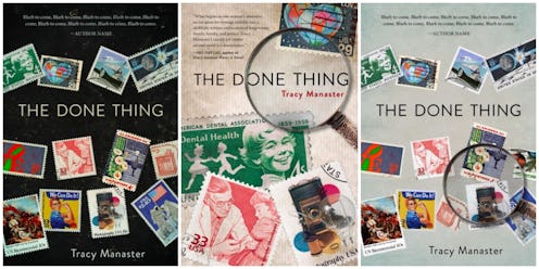
Here's where I absolutely fell in love. This "Victory Over Polio" stamp speaks to so many aspects of the book at once without spelling anything out. The postage itself evokes the correspondence that is fundamental to the plot. Its honoree, Dr. Jonas Salk, positions some of the action very firmly in the past, evoking Lida's childhood, which overlapped the advent of the polio vaccine. At first glance, doctor and patient could well be father and daughter, mirroring a father/daughter relationship that is one of the novel's most fraught. And there's something irresistible about the image of a benign injection on the cover of a book whose stakes include execution by lethal injection.
There were concerns: did this particular stamp implicitly promise a biography of Dr. Salk? Would readers assume the book was about or tangential to the vaccination debate? Was the image itself too faded? Was the papery background quite right? But we had our core concept; all that remained was to finalize the details.


There were a lot of details: Was the black background too stark? Did they gray skew a bit textbook? Should we return to the initial parchment? Would it pop enough against the white background of any reviewing publications? Was there enough space for blurbs? Did the title get lost? How many stamps were were too many? Which should we keep? Did the magnifying glass add clutter, or focus?
After a flurry of emails, we concluded: yes, yes, yes, yes, no (but we would adjust and make room), a little (but we would tweak it), and that any more than four stamps would be too many. We narrowed our choices to ones that worked on more than one level at once, hinting at theme while situating the book more squarely in time, for instance, or evoking at Lida's childhood circumstances and adult situation simultaneously. Dr. Salk got to stay, as did the magnifying glass, positioned a to call attention to the title.

I spent the months between design and release ogling the cover on the Tyrus homepage, on my own website, on Amazon, Barnes and Noble, and Indiebound. I jumped at the offer to keep the giant poster of it my publisher had made for BookExpo America. On more than one occasion, the stamps themselves popped up in my dreams. And then last week I saw the book itself, out on the shelves, facing the world. I paused, noticing for the first time that the position of the magnifying glass created a phrase within the title--one thing--a clever bit of visual wordplay that hadn't previously registered. I was already beaming, there in the bookstore. My smile graduated to outright laughter. I'd known the design was good but it hadn't realized how good; they'd created a cover that got its own author to do a double take, and this after looking at it obsessively for months.
The Done Thing by Tracy Manaster, $21.97, Amazon
