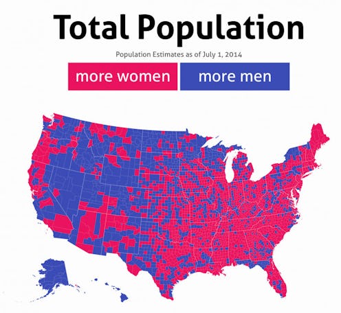
Many places around the United States have an uneven geographical gender divide, with some areas being more male-dominated and others overpopulated with women. If you're wondering where those areas are and how they change as you get older, these new interactive maps from Dadaviz will show you just that. Jishai Evers of Dadaviz used data from the U.S. Census to compile these interactive maps which shows where more men and more women are located throughout the country by county, using the common gendered colors blue and pink to ascribe these differences visually. The maps also show how this gender divide varies by age groups, ranging from ages five and under all the way to 85 and over.
One thing you'll see when you look at the maps is that they get progressively more pink as the age groups increase. Why is that? It's not a simple answer, so let's take it step by step. First, consider the fact that women are slightly more likely to give birth to baby boys than baby girls. For every 1,000 baby girls that are born, there are 1,050 baby boys — a phenomenon which is often attributed to male babies having a lower chance of survival. More postpartum complications means that they're more vulnerable to dying as an infant than female babies. So, that's why we start out with comparatively more blue space in the maps than pink.
There are also a ton of environmental and personal health factors that go into your likelihood of having a boy or girl, from stress, to birth order, and age of the mother. Sex selective abortion could also play a role here.

Then we have to start considering why the maps get more pink the older the age group we're looking at. What's going on here is that women are outliving men by huge numbers these days. The average life expectancy of an American man is about 77 years, while for American women, it's almost 82 years — which is almost a five-year difference. At age 85, women outnumber men by a 2:1 ratio, meaning that women make up 66 percent of the 85+ population! This age gap could actually be larger if women had the same economic opportunity and resources as men do, so women could potentially start outliving men even more as we collectively gain gender equality.

The final reason that the maps have such stark differences is because of location preference, as some areas attract more women and others more men. More men live in states out West like Wyoming and Alaska, while women dominate in Northeastern states such as Maryland and New York. Women also do make up 50.8 percent of the US population, a majority, so most states have more women in them than men.
Head on over to Dadaviz to see more.
Images: Dadaviz (4)
