Case Study
Same House, New Costume
An architecture critic explains how the farmhouse aesthetic took over.

There comes a point in every era where one can look back and identify the dominant hegemonic residential aesthetic of the past decade, and, in the case of the 2010s, the aesthetic in question was “the farmhouse.” Americans love to do a kind of widespread architectural costuming — throughout history, we’ve dressed our houses in themes ranging from “colonial” to “Tudor” to “Tuscan.” The farmhouse is no different.
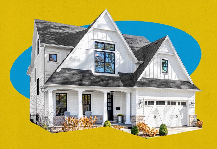
Technically, the style is called “modern farmhouse” — after all, waterfall quartz countertops were not available to America’s 19th-century homesteaders, or featured in America’s original rural vernacular architecture. It’s characterized by a rustic feel that blends the shabby chic of the ’90s, a tweeness borrowed from the mid-century modern revival, and the white-and-gray dominance of what I’ve called “normie minimalism.” If you’ve spent any portion of this pandemic fantasy-shopping on Zillow, you know the look: Everything is whitewashed, with rough-hewn wood accents and reclaimed windows, and cutesy little chalkboard-painted art hangs on sparse, slate-gray walls. The floor plans are always blown wide open, the overhead lights are always pendants, the cabinets always painted. The same irony applies to the modern farmhouse as that of eras past. There were no Tudors in Lakewood, Ohio, and Tuscany couldn’t be further from Pasadena, California, and the modern farmhouse, nestled in the country’s affluent suburbs and exurbs, has nothing to do with the actual business of farming anything besides Instagram likes.
How did we get here? The obvious answer is HGTV, which has taken over the role previously played by magazines like House Beautiful and Better Homes and Gardens. HGTV launched its hit show Fixer Upper in 2013, and its stars Chip and Joanna Gaines popularized the style, helped along by the network’s other shows, gladly assimilating into a singular, consistent, salable design language. HGTV thrives from advertisement and sponsorships from the home improvement industry, and maintaining a single style helps standardize aesthetics across those industries, which is why you can buy Magnolia Home accents at Target and herringbone white subway tile at Home Depot.
It took two decades for HGTV and its ilk to streamline the process of creating design hegemony — to perfect the concept of having multiple shows congeal around the same aesthetic rather than let them exist at the whims of their individual hosts, as was more the case in the 2000s. While previous eras of design (think midcentury modernism) were spearheaded by architects, interior designers, and other tastemakers, in the late ’90s, capital-A Architecture lost interest in the home — deconstructivist ideas and new, high-tech forms were better suited to museums and universities — and a coalition of real estate developers, home improvement and furniture stores, and TV decorators stepped in to take their place. The worlds of high culture and popular consumption in residential design have never been more separate, and, in this critic’s opinion, both suffer as a result.
But why the farmhouse? The United States, a former agricultural colony, has always had a nostalgia for rural life that makes its way into broader culture in a variety of forms, and the idea that rural life is somehow more honest and inherently American than urban life is a powerful trope that has become only more politicized since the Reagan administration. But the original farmhouses, the nameless, vernacular wood-framed buildings that can still be seen dotting the landscapes of the South and Midwest, were humble, meant to shelter from the elements and nurture the life within and nothing more. The modern farmhouse is a status symbol with a facade of humble, plucky folksiness. It is the Yeti cooler of houses.
Besides, can an open-plan kitchen with a barn-height ceiling bring an aura of casual realness to suburbia? Perhaps, but it requires 3,500 square feet, and green space is dwindling. New developments of modern farmhouses sit on postage-stamp-sized lots. When you look outside, all you see are other modern farmhouses. It’s no different than any other large suburban home — it’s the same house, just in a new costume. It makes sense for it to be this way; after all, we’re talking about a concept that’s salable, and renovation is much easier if you can just swap out one type of cabinetry for another. Soon, and not soon enough, the modern farmhouse will grow old, just like its predecessors, and our media overlords will have no problem feeding us the next big thing in 30-minute increments, packed into slow TV nights when there’s not much else to watch.